Dependencies
This layout uses the following components as "atoms" to create the full UI.
Extends: Layouts: Components:Default view
A smaller hero theme for an article of a cms typed page. Useful when only smaller images are available and cannot stretch the full width of a desktop browser.
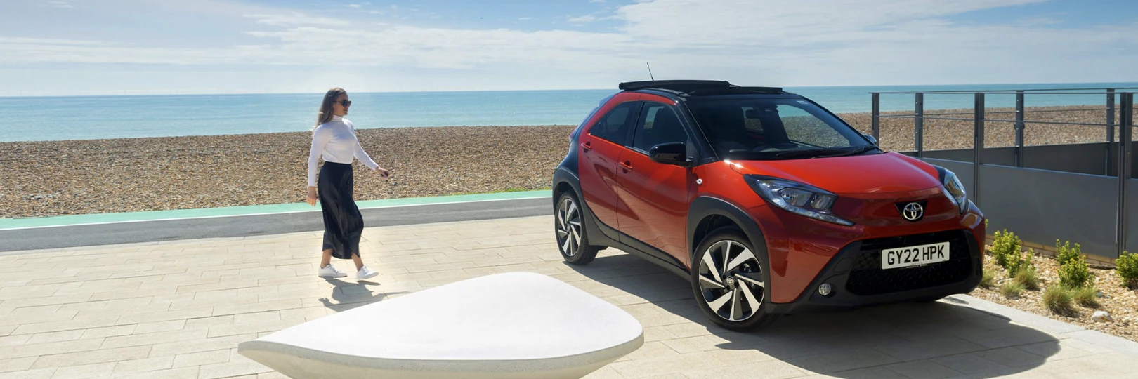
Hero Title
Lorem ipsum dolor sit amet consectetur adipisicing elit. Enim officiis neque consectetur.
<header class="c-hero c-hero--compact c-hero--overlay">
<div class="c-hero__media">
<picture class="c-hero__picture">
<source srcset="/assets/img/ds/layouts/site/hero/compact/1-hero-mobile.webp"
media="(max-width: 414px)"
type="image/webp"
>
<source srcset="/assets/img/ds/layouts/site/hero/compact/1-hero-mobile-lg.webp"
media="(min-width: 415px) and (max-width: 582px)"
type="image/webp"
>
<source srcset="/assets/img/ds/layouts/site/hero/compact/1-hero-tablet.webp"
media="(min-width: 583px) and (max-width: 834px)"
type="image/webp"
>
<source srcset="/assets/img/ds/layouts/site/hero/compact/1-hero-tablet-lg.webp"
media="(min-width: 835px) and (max-width: 1024px)"
type="image/webp"
>
<source srcset="/assets/img/ds/layouts/site/hero/compact/1-hero-laptop.webp"
media="(min-width: 1025px) and (max-width: 1264px)"
type="image/webp"
>
<source srcset="/assets/img/ds/layouts/site/hero/compact/1-hero-desktop.webp"
media="(min-width: 1265px)"
type="image/webp"
>
<img class="c-hero__img c-img | o-fit"
src="/assets/img/ds/layouts/site/hero/compact/1-hero-desktop.webp"
width="1620" height="540"
alt>
</picture>
</div>
<div class="c-hero__body">
<div class="c-hero__body-description">
<h1 class="c-hero-heading | u-heading u-alpha">Hero Title</h1>
<p class="c-hero-lead | u-lead u-gamma">Lorem ipsum dolor sit amet consectetur adipisicing elit. Enim officiis neque consectetur.</p>
</div>
</div>
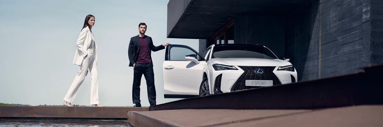
</header>With actions
Add a maximum of 2 call to actions within the hero body.
<header class="c-hero c-hero--compact c-hero--overlay">
    <div class="c-hero__media">
        <picture class="c-hero__picture">
            <source srcset="/assets/img/ds/layouts/site/hero/compact/2-hero-mobile.webp"
                    media="(max-width: 414px)"
                    type="image/webp"
            >
            <source srcset="/assets/img/ds/layouts/site/hero/compact/2-hero-mobile-lg.webp"
                    media="(min-width: 415px) and (max-width: 582px)"
                    type="image/webp"
            >
            <source srcset="/assets/img/ds/layouts/site/hero/compact/2-hero-tablet.webp"
                    media="(min-width: 583px) and (max-width: 834px)"
                    type="image/webp"
            >
            <source srcset="/assets/img/ds/layouts/site/hero/compact/2-hero-tablet-lg.webp"
                    media="(min-width: 835px) and (max-width: 1024px)"
                    type="image/webp"
            >
            <source srcset="/assets/img/ds/layouts/site/hero/compact/2-hero-laptop.webp"
                    media="(min-width: 1025px) and (max-width: 1264px)"
                    type="image/webp"
            >
            <source srcset="/assets/img/ds/layouts/site/hero/compact/2-hero-desktop.webp"
                    media="(min-width: 1265px)"
                    type="image/webp"
            >
            <img class="c-hero__img c-img | o-fit"
                src="/assets/img/ds/layouts/site/hero/compact/2-hero-desktop.webp"
                width="1620" height="540"
                alt>
        </picture>
    </div>
    <div class="c-hero__body">
        <div class="c-hero__body-description">
            <h1 class="c-hero-heading | u-heading u-alpha">Hero Title</h1>
            <p class="c-hero-lead | u-lead u-gamma">Lorem ipsum dolor sit amet consectetur adipisicing elit. Enim officiis neque consectetur.</p>
        </div>
        <div class="c-hero__body-actions">
            <a class="c-btn c-btn--primary" href="#hero_button_1">Button 1</a>
            <a class="c-btn c-btn--secondary" href="#hero_button_2">Button 2</a>
        </div>
    </div>
</header><header class="c-hero c-hero--compact c-hero--overlay">
<div class="c-hero__media">
<picture class="c-hero__picture">
<source srcset="/assets/img/ds/layouts/site/hero/compact/2-hero-mobile.webp"
media="(max-width: 414px)"
type="image/webp"
>
<source srcset="/assets/img/ds/layouts/site/hero/compact/2-hero-mobile-lg.webp"
media="(min-width: 415px) and (max-width: 582px)"
type="image/webp"
>
<source srcset="/assets/img/ds/layouts/site/hero/compact/2-hero-tablet.webp"
media="(min-width: 583px) and (max-width: 834px)"
type="image/webp"
>
<source srcset="/assets/img/ds/layouts/site/hero/compact/2-hero-tablet-lg.webp"
media="(min-width: 835px) and (max-width: 1024px)"
type="image/webp"
>
<source srcset="/assets/img/ds/layouts/site/hero/compact/2-hero-laptop.webp"
media="(min-width: 1025px) and (max-width: 1264px)"
type="image/webp"
>
<source srcset="/assets/img/ds/layouts/site/hero/compact/2-hero-desktop.webp"
media="(min-width: 1265px)"
type="image/webp"
>
<img class="c-hero__img c-img | o-fit"
src="/assets/img/ds/layouts/site/hero/compact/2-hero-desktop.webp"
width="1620" height="540"
alt>
</picture>
</div>
<div class="c-hero__body c-hero__body--vertical">
<div class="c-hero__body-description">
<h1 class="c-hero-heading | u-heading u-alpha">Hero Title</h1>
<p class="c-hero-lead | u-lead u-gamma">Lorem ipsum dolor sit amet consectetur adipisicing elit. Enim officiis neque consectetur.</p>
</div>
<div class="c-hero__body-actions">
<a class="c-btn c-btn--primary" href="#hero_button_1">Button 1</a>
<a class="c-btn c-btn--secondary" href="#hero_button_2">Button 2</a>
</div>
</div>
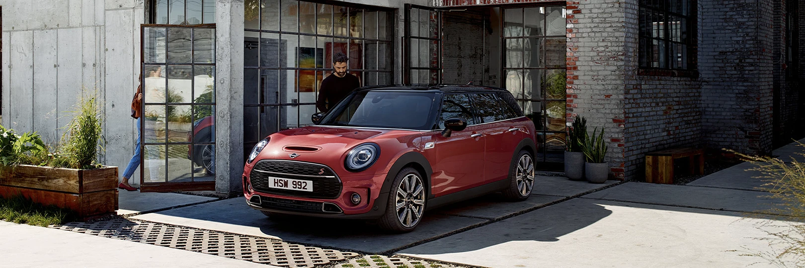
</header>Body alignment
Set alignment for the body element. Mostly to allow customers to focus on a focal point within an image or media element without overlapping text.
Hero Title
Lorem ipsum dolor sit amet consectetur adipisicing elit. Enim officiis neque consectetur.
Hero Title
Lorem ipsum dolor sit amet consectetur adipisicing elit. Enim officiis neque consectetur.
Hero Title
Lorem ipsum dolor sit amet consectetur adipisicing elit. Enim officiis neque consectetur.
Hero Title
Lorem ipsum dolor sit amet consectetur adipisicing elit. Enim officiis neque consectetur.
Hero Title
Lorem ipsum dolor sit amet consectetur adipisicing elit. Enim officiis neque consectetur.
Hero Title
Lorem ipsum dolor sit amet consectetur adipisicing elit. Enim officiis neque consectetur.
Hero Title
Lorem ipsum dolor sit amet consectetur adipisicing elit. Enim officiis neque consectetur.
Hero Title
Lorem ipsum dolor sit amet consectetur adipisicing elit. Enim officiis neque consectetur.
Hero Title
Lorem ipsum dolor sit amet consectetur adipisicing elit. Enim officiis neque consectetur.
<header class="c-hero c-hero--compact c-hero--overlay">
    <div class="c-hero__media">
        <picture class="c-hero__picture">
            <source srcset="/assets/img/ds/layouts/site/hero/compact/3-hero-mobile.webp"
                    media="(max-width:414)"
                    type="image/webp"
            >
            <source srcset="/assets/img/ds/layouts/site/hero/compact/3-hero-mobile-lg.webp"
                    media="(min-width: 415px) and (max-width: 582px)"
                    type="image/webp"
            >
            <source srcset="/assets/img/ds/layouts/site/hero/compact/3-hero-tablet.webp"
                    media="(min-width: 583px) and (max-width: 834px)"
                    type="image/webp"
            >
            <source srcset="/assets/img/ds/layouts/site/hero/compact/3-hero-tablet-lg.webp"
                    media="(min-width: 835px) and (max-width: 1024px)"
                    type="image/webp"
            >
            <source srcset="/assets/img/ds/layouts/site/hero/compact/3-hero-laptop.webp"
                    media="(min-width: 1025px) and (max-width: 1264px)"
                    type="image/webp"
            >
            <source srcset="/assets/img/ds/layouts/site/hero/compact/3-hero-desktop.webp"
                    media="(min-width: 1265px)"
                    type="image/webp"
            >
            <img class="c-hero__img c-img | o-fit"
                src="/assets/img/ds/layouts/site/hero/compact/3-hero-desktop.webp"
                width="1620" height="540"
                alt>
        </picture>
    </div>
    <div class="c-hero__body">
        <div class="c-hero__body-description">
            <h1 class="c-hero-heading | u-heading u-alpha">Hero Title</h1>
            <p class="c-hero-lead | u-lead u-gamma">Lorem ipsum dolor sit amet consectetur adipisicing elit. Enim officiis neque consectetur.</p>
        </div>
    </div>
</header><header class="c-hero c-hero--compact c-hero--overlay c-hero--center">
<div class="c-hero__media">
<picture class="c-hero__picture">
<source srcset="/assets/img/ds/layouts/site/hero/compact/3-hero-mobile.webp"
media="(max-width:414)"
type="image/webp"
>
<source srcset="/assets/img/ds/layouts/site/hero/compact/3-hero-mobile-lg.webp"
media="(min-width: 415px) and (max-width: 582px)"
type="image/webp"
>
<source srcset="/assets/img/ds/layouts/site/hero/compact/3-hero-tablet.webp"
media="(min-width: 583px) and (max-width: 834px)"
type="image/webp"
>
<source srcset="/assets/img/ds/layouts/site/hero/compact/3-hero-tablet-lg.webp"
media="(min-width: 835px) and (max-width: 1024px)"
type="image/webp"
>
<source srcset="/assets/img/ds/layouts/site/hero/compact/3-hero-laptop.webp"
media="(min-width: 1025px) and (max-width: 1264px)"
type="image/webp"
>
<source srcset="/assets/img/ds/layouts/site/hero/compact/3-hero-desktop.webp"
media="(min-width: 1265px)"
type="image/webp"
>
<img class="c-hero__img c-img | o-fit"
src="/assets/img/ds/layouts/site/hero/compact/3-hero-desktop.webp"
width="1620" height="540"
alt>
</picture>
</div>
<div class="c-hero__body">
<div class="c-hero__body-description">
<h1 class="c-hero-heading | u-heading u-alpha">Hero Title</h1>
<p class="c-hero-lead | u-lead u-gamma">Lorem ipsum dolor sit amet consectetur adipisicing elit. Enim officiis neque consectetur.</p>
</div>
</div>
</header><header class="c-hero c-hero--compact c-hero--overlay c-hero--right">
<div class="c-hero__media">
<picture class="c-hero__picture">
<source srcset="/assets/img/ds/layouts/site/hero/compact/3-hero-mobile.webp"
media="(max-width:414)"
type="image/webp"
>
<source srcset="/assets/img/ds/layouts/site/hero/compact/3-hero-mobile-lg.webp"
media="(min-width: 415px) and (max-width: 582px)"
type="image/webp"
>
<source srcset="/assets/img/ds/layouts/site/hero/compact/3-hero-tablet.webp"
media="(min-width: 583px) and (max-width: 834px)"
type="image/webp"
>
<source srcset="/assets/img/ds/layouts/site/hero/compact/3-hero-tablet-lg.webp"
media="(min-width: 835px) and (max-width: 1024px)"
type="image/webp"
>
<source srcset="/assets/img/ds/layouts/site/hero/compact/3-hero-laptop.webp"
media="(min-width: 1025px) and (max-width: 1264px)"
type="image/webp"
>
<source srcset="/assets/img/ds/layouts/site/hero/compact/3-hero-desktop.webp"
media="(min-width: 1265px)"
type="image/webp"
>
<img class="c-hero__img c-img | o-fit"
src="/assets/img/ds/layouts/site/hero/compact/3-hero-desktop.webp"
width="1620" height="540"
alt>
</picture>
</div>
<div class="c-hero__body">
<div class="c-hero__body-description">
<h1 class="c-hero-heading | u-heading u-alpha">Hero Title</h1>
<p class="c-hero-lead | u-lead u-gamma">Lorem ipsum dolor sit amet consectetur adipisicing elit. Enim officiis neque consectetur.</p>
</div>
</div>
</header><header class="c-hero c-hero--compact c-hero--overlay c-hero--middle c-hero--right">
<div class="c-hero__media">
<picture class="c-hero__picture">
<source srcset="/assets/img/ds/layouts/site/hero/compact/3-hero-mobile.webp"
media="(max-width:414)"
type="image/webp"
>
<source srcset="/assets/img/ds/layouts/site/hero/compact/3-hero-mobile-lg.webp"
media="(min-width: 415px) and (max-width: 582px)"
type="image/webp"
>
<source srcset="/assets/img/ds/layouts/site/hero/compact/3-hero-tablet.webp"
media="(min-width: 583px) and (max-width: 834px)"
type="image/webp"
>
<source srcset="/assets/img/ds/layouts/site/hero/compact/3-hero-tablet-lg.webp"
media="(min-width: 835px) and (max-width: 1024px)"
type="image/webp"
>
<source srcset="/assets/img/ds/layouts/site/hero/compact/3-hero-laptop.webp"
media="(min-width: 1025px) and (max-width: 1264px)"
type="image/webp"
>
<source srcset="/assets/img/ds/layouts/site/hero/compact/3-hero-desktop.webp"
media="(min-width: 1265px)"
type="image/webp"
>
<img class="c-hero__img c-img | o-fit"
src="/assets/img/ds/layouts/site/hero/compact/3-hero-desktop.webp"
width="1620" height="540"
alt>
</picture>
</div>
<div class="c-hero__body">
<div class="c-hero__body-description">
<h1 class="c-hero-heading | u-heading u-alpha">Hero Title</h1>
<p class="c-hero-lead | u-lead u-gamma">Lorem ipsum dolor sit amet consectetur adipisicing elit. Enim officiis neque consectetur.</p>
</div>
</div>
</header><header class="c-hero c-hero--compact c-hero--overlay c-hero--middle c-hero--center">
<div class="c-hero__media">
<picture class="c-hero__picture">
<source srcset="/assets/img/ds/layouts/site/hero/compact/3-hero-mobile.webp"
media="(max-width:414)"
type="image/webp"
>
<source srcset="/assets/img/ds/layouts/site/hero/compact/3-hero-mobile-lg.webp"
media="(min-width: 415px) and (max-width: 582px)"
type="image/webp"
>
<source srcset="/assets/img/ds/layouts/site/hero/compact/3-hero-tablet.webp"
media="(min-width: 583px) and (max-width: 834px)"
type="image/webp"
>
<source srcset="/assets/img/ds/layouts/site/hero/compact/3-hero-tablet-lg.webp"
media="(min-width: 835px) and (max-width: 1024px)"
type="image/webp"
>
<source srcset="/assets/img/ds/layouts/site/hero/compact/3-hero-laptop.webp"
media="(min-width: 1025px) and (max-width: 1264px)"
type="image/webp"
>
<source srcset="/assets/img/ds/layouts/site/hero/compact/3-hero-desktop.webp"
media="(min-width: 1265px)"
type="image/webp"
>
<img class="c-hero__img c-img | o-fit"
src="/assets/img/ds/layouts/site/hero/compact/3-hero-desktop.webp"
width="1620" height="540"
alt>
</picture>
</div>
<div class="c-hero__body">
<div class="c-hero__body-description">
<h1 class="c-hero-heading | u-heading u-alpha">Hero Title</h1>
<p class="c-hero-lead | u-lead u-gamma">Lorem ipsum dolor sit amet consectetur adipisicing elit. Enim officiis neque consectetur.</p>
</div>
</div>
</header><header class="c-hero c-hero--compact c-hero--overlay c-hero--middle c-hero--left">
<div class="c-hero__media">
<picture class="c-hero__picture">
<source srcset="/assets/img/ds/layouts/site/hero/compact/3-hero-mobile.webp"
media="(max-width:414)"
type="image/webp"
>
<source srcset="/assets/img/ds/layouts/site/hero/compact/3-hero-mobile-lg.webp"
media="(min-width: 415px) and (max-width: 582px)"
type="image/webp"
>
<source srcset="/assets/img/ds/layouts/site/hero/compact/3-hero-tablet.webp"
media="(min-width: 583px) and (max-width: 834px)"
type="image/webp"
>
<source srcset="/assets/img/ds/layouts/site/hero/compact/3-hero-tablet-lg.webp"
media="(min-width: 835px) and (max-width: 1024px)"
type="image/webp"
>
<source srcset="/assets/img/ds/layouts/site/hero/compact/3-hero-laptop.webp"
media="(min-width: 1025px) and (max-width: 1264px)"
type="image/webp"
>
<source srcset="/assets/img/ds/layouts/site/hero/compact/3-hero-desktop.webp"
media="(min-width: 1265px)"
type="image/webp"
>
<img class="c-hero__img c-img | o-fit"
src="/assets/img/ds/layouts/site/hero/compact/3-hero-desktop.webp"
width="1620" height="540"
alt>
</picture>
</div>
<div class="c-hero__body">
<div class="c-hero__body-description">
<h1 class="c-hero-heading | u-heading u-alpha">Hero Title</h1>
<p class="c-hero-lead | u-lead u-gamma">Lorem ipsum dolor sit amet consectetur adipisicing elit. Enim officiis neque consectetur.</p>
</div>
</div>
</header><header class="c-hero c-hero--compact c-hero--overlay c-hero--top c-hero--left">
<div class="c-hero__media">
<picture class="c-hero__picture">
<source srcset="/assets/img/ds/layouts/site/hero/compact/3-hero-mobile.webp"
media="(max-width:414)"
type="image/webp"
>
<source srcset="/assets/img/ds/layouts/site/hero/compact/3-hero-mobile-lg.webp"
media="(min-width: 415px) and (max-width: 582px)"
type="image/webp"
>
<source srcset="/assets/img/ds/layouts/site/hero/compact/3-hero-tablet.webp"
media="(min-width: 583px) and (max-width: 834px)"
type="image/webp"
>
<source srcset="/assets/img/ds/layouts/site/hero/compact/3-hero-tablet-lg.webp"
media="(min-width: 835px) and (max-width: 1024px)"
type="image/webp"
>
<source srcset="/assets/img/ds/layouts/site/hero/compact/3-hero-laptop.webp"
media="(min-width: 1025px) and (max-width: 1264px)"
type="image/webp"
>
<source srcset="/assets/img/ds/layouts/site/hero/compact/3-hero-desktop.webp"
media="(min-width: 1265px)"
type="image/webp"
>
<img class="c-hero__img c-img | o-fit"
src="/assets/img/ds/layouts/site/hero/compact/3-hero-desktop.webp"
width="1620" height="540"
alt>
</picture>
</div>
<div class="c-hero__body">
<div class="c-hero__body-description">
<h1 class="c-hero-heading | u-heading u-alpha">Hero Title</h1>
<p class="c-hero-lead | u-lead u-gamma">Lorem ipsum dolor sit amet consectetur adipisicing elit. Enim officiis neque consectetur.</p>
</div>
</div>
</header><header class="c-hero c-hero--compact c-hero--overlay c-hero--top c-hero--center">
<div class="c-hero__media">
<picture class="c-hero__picture">
<source srcset="/assets/img/ds/layouts/site/hero/compact/3-hero-mobile.webp"
media="(max-width:414)"
type="image/webp"
>
<source srcset="/assets/img/ds/layouts/site/hero/compact/3-hero-mobile-lg.webp"
media="(min-width: 415px) and (max-width: 582px)"
type="image/webp"
>
<source srcset="/assets/img/ds/layouts/site/hero/compact/3-hero-tablet.webp"
media="(min-width: 583px) and (max-width: 834px)"
type="image/webp"
>
<source srcset="/assets/img/ds/layouts/site/hero/compact/3-hero-tablet-lg.webp"
media="(min-width: 835px) and (max-width: 1024px)"
type="image/webp"
>
<source srcset="/assets/img/ds/layouts/site/hero/compact/3-hero-laptop.webp"
media="(min-width: 1025px) and (max-width: 1264px)"
type="image/webp"
>
<source srcset="/assets/img/ds/layouts/site/hero/compact/3-hero-desktop.webp"
media="(min-width: 1265px)"
type="image/webp"
>
<img class="c-hero__img c-img | o-fit"
src="/assets/img/ds/layouts/site/hero/compact/3-hero-desktop.webp"
width="1620" height="540"
alt>
</picture>
</div>
<div class="c-hero__body">
<div class="c-hero__body-description">
<h1 class="c-hero-heading | u-heading u-alpha">Hero Title</h1>
<p class="c-hero-lead | u-lead u-gamma">Lorem ipsum dolor sit amet consectetur adipisicing elit. Enim officiis neque consectetur.</p>
</div>
</div>
</header><header class="c-hero c-hero--compact c-hero--overlay c-hero--top c-hero--right">
<div class="c-hero__media">
<picture class="c-hero__picture">
<source srcset="/assets/img/ds/layouts/site/hero/compact/3-hero-mobile.webp"
media="(max-width:414)"
type="image/webp"
>
<source srcset="/assets/img/ds/layouts/site/hero/compact/3-hero-mobile-lg.webp"
media="(min-width: 415px) and (max-width: 582px)"
type="image/webp"
>
<source srcset="/assets/img/ds/layouts/site/hero/compact/3-hero-tablet.webp"
media="(min-width: 583px) and (max-width: 834px)"
type="image/webp"
>
<source srcset="/assets/img/ds/layouts/site/hero/compact/3-hero-tablet-lg.webp"
media="(min-width: 835px) and (max-width: 1024px)"
type="image/webp"
>
<source srcset="/assets/img/ds/layouts/site/hero/compact/3-hero-laptop.webp"
media="(min-width: 1025px) and (max-width: 1264px)"
type="image/webp"
>
<source srcset="/assets/img/ds/layouts/site/hero/compact/3-hero-desktop.webp"
media="(min-width: 1265px)"
type="image/webp"
>
<img class="c-hero__img c-img | o-fit"
src="/assets/img/ds/layouts/site/hero/compact/3-hero-desktop.webp"
width="1620" height="540"
alt>
</picture>
</div>
<div class="c-hero__body">
<div class="c-hero__body-description">
<h1 class="c-hero-heading | u-heading u-alpha">Hero Title</h1>
<p class="c-hero-lead | u-lead u-gamma">Lorem ipsum dolor sit amet consectetur adipisicing elit. Enim officiis neque consectetur.</p>
</div>
</div>
</header>Adding video
Add a background video clip as a media element instead of using an image.
Hero Title
Lorem ipsum dolor sit amet consectetur adipisicing elit. Enim officiis neque consectetur.
<header class="c-hero c-hero--compact c-hero--overlay" data-hero>
    <div class="c-hero__media">
        <video class="c-hero__video | o-fit" poster="/assets/img/ds/layouts/articles/hero/compact/4-hero-poster.webp" preload="metadata" muted loop data-hero-video>
            <source data-src="/assets/video/ds/layouts/articles/hero/compact/xc90-hero-21x9.mp4" type="video/mp4">
        </video>
    </div>
    <div class="c-hero__body">
        <div class="c-hero__body-description">
            <h1 class="c-hero-heading | u-heading u-alpha">Hero Title</h1>
            <p class="c-hero-lead | u-lead u-gamma">Lorem ipsum dolor sit amet consectetur adipisicing elit. Enim officiis neque consectetur.</p>
        </div>
    </div>
</header>