Notes:
A few things to note when using the <dialog> element.
window.#id.showModal()should be used to open the<dialog>.window.#id.open()can be used, however this comes with reduced accessibility and functionality. It's necessary to be aware of how each of these techniques open the<dialog>and to factor in any additional development for loss of functionality.- Using the
<dialog>element means there is no click outside (or the backdrop) to close/exit the modal. However a user can still use the Esc key to close the<dialog>. - The
<dialog>element has an autofocus feature, which focuses the first selectable element when opening the modal. If content is scrollable and the first selectable element is at the bottom of the content it will focus and auto scroll to the bottom. This won't be desirable behaviour for this context, so have a plan to manage this. A good way to do it, is to autofocus a close button at the top so that when the modal opens it does not automatically scroll to the bottom. - Close the
<dialog>element by submitting a form within the dialog (for pages that are not surrounded by a master form element), with<button formmethod="dialog">Cancel</button>. Useonclick="window.#id.close()"to close the<dialog>in any other scenario. - Ensure that developers know what happens when a required input is used inside a form, within the
<dialog>element and how it affects closing it. - Whilst the
<dialog>renders all other page elements inert, it does not stop page scrolling.
Basic Example
A basic sidebar modal using <dialog>.
Alignment
The sidebar <dialog> can aligned to the left or right of the viewport.
Body Elements
Add a header and/or footer area to the sidebar body.
Close
Add a close button inside or outside the main "body".
Useful notes and reading:
Related Components:
Useful Links:
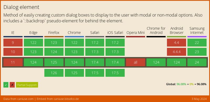
Support:
Support for the dialog element.