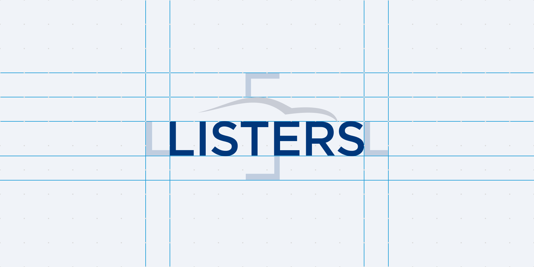
Anatomy
Optical kerning, refined weight and defined clear space, as well as delineated placement in relation to other content helps to make the logo as instantly recognisable as possible at all sizes and in all contexts.
Formats
We use three different versions of the company logo based on different situations.
Full
The full logo is used when the brand communication is strong and prominent. It needs a big white space area around it in order to keep the logo readable.

Mark
The mark logo is often used when the brand identity should not be so prominent and when there is not enough room for the full logo.


Icons
Icons are versions of the mark logo. The stroke is thicker in order to keep readability on small sizes. Generally used for tab icons, meta icons and system images.
Resources
Check the assets section under the development tab to download Listers logos.